Choosing the perfect yarn colors for your knitting or crochet project can feel overwhelming. That moment of standing before a wall of colorful skeins, wondering which combinations will create harmony rather than chaos, is something every crafter experiences.
But selecting colors that work beautifully together doesn't require an art degree—just some basic understanding of color relationships and a few practical techniques. In this guide, we'll unlock the secrets to picking yarn colors that match perfectly, turning your next project into a visual masterpiece.
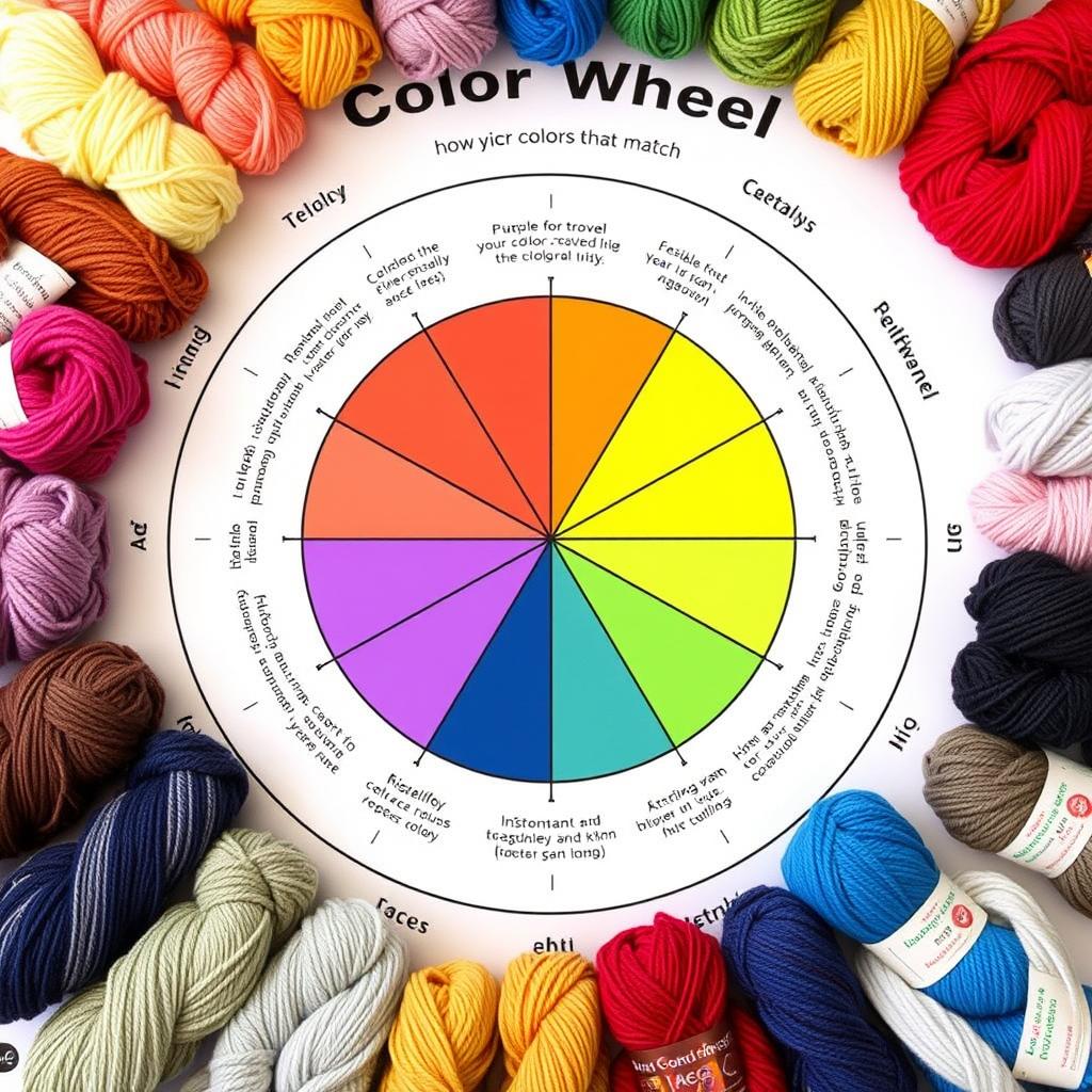
Understanding Color Theory Basics

The color wheel is your best friend when selecting yarn colors that work together
Color theory might sound technical, but it's actually a practical framework that helps us understand why certain colors look good together. At its heart is the color wheel—a visual representation of color relationships that has guided artists and designers for centuries.
Primary, Secondary, and Tertiary Colors
The color wheel starts with three primary colors: red, blue, and yellow. These are the building blocks from which all other colors are created. When you mix two primary colors, you get secondary colors: purple (red + blue), green (blue + yellow), and orange (red + yellow). Mix a primary with its neighboring secondary color, and you create tertiary colors like red-orange or blue-green.
Color Schemes That Always Work
Complementary Colors
Colors that sit opposite each other on the color wheel create striking, high-contrast combinations. Think blue and orange, purple and yellow, or red and green. These pairings create visual excitement and make each color appear more vibrant.

Analogous Colors
Colors that sit next to each other on the color wheel create harmonious, soothing combinations. For example, blue, blue-green, and green, or red, red-orange, and orange. These combinations feel cohesive and natural.

Other Effective Color Schemes
Monochromatic
Using different shades, tints, and tones of a single color creates a sophisticated, cohesive look. For example, a project using light blue, medium blue, and navy creates depth while maintaining harmony.
Split Complementary
Choose one color, then use the two colors adjacent to its complement. For example, if you choose blue, you'd pair it with red-orange and yellow-orange (the colors on either side of orange). This creates contrast but is less intense than pure complementary pairs.

How Project Type Affects Your Color Choices
The type of project you're creating should influence your color selection. Different items serve different purposes and will be viewed in different contexts.
Wearable Items
For garments like sweaters, scarves, and hats, consider:
- Who will wear it and what colors complement their skin tone and existing wardrobe
- Where the item will be worn (casual everyday wear vs. special occasions)
- Seasonal appropriateness (lighter, brighter colors for spring/summer; deeper, richer tones for fall/winter)

Home Décor
For blankets, pillows, and other home items, consider:
- The existing color scheme of the room where the item will be displayed
- Whether you want the piece to blend in or stand out as a focal point
- Practical concerns (e.g., lighter colors show dirt more easily in high-traffic areas)

Baby and Children's Items
When creating for little ones, consider:
- Durability and washability (darker colors hide stains better)
- Traditional gender associations if relevant (or intentionally break these conventions)
- Bright, high-contrast colors for visual stimulation for very young babies

Helpful Tools for Selecting Yarn Colors
You don't have to rely solely on your eye when choosing colors. Several tools can help you make confident color decisions.
Physical Color Wheels
A portable color wheel is an invaluable tool for any crafter. Look for one specifically designed for yarn and fiber arts, which will include information about color relationships and suggested combinations.

Digital Color Tools
Several websites and apps can help you create and test color palettes:
- Coolors.co - Generate color schemes and adjust them to your liking
- Adobe Color - Create color schemes based on color theory rules
- Colorspace - Enter one color and get matching palette suggestions

Yarn Company Resources
Many yarn manufacturers offer tools specifically for their products:
- Color cards showing all available shades in a particular yarn line
- Suggested color combinations on their websites or pattern books
- Online visualizers that let you see how different colors work together

Testing Your Color Combinations
Before committing to a full project, it's wise to test how your chosen colors work together in practice.
Swatching Techniques
Creating small test swatches is the most reliable way to see how colors interact in your chosen stitch pattern:
- Make a small swatch using all your chosen colors in the pattern you plan to use
- For striped projects, test different stripe widths to see what proportion of each color works best
- For colorwork, check that there's enough contrast between colors for the pattern to be visible

Checking in Different Lighting
Colors can look dramatically different depending on the light:
- Check your yarn combinations in natural daylight, which shows true colors
- Also view them under the artificial lighting where the item will be used or worn
- Remember that some colors (especially blues and greens) can look very different under fluorescent lighting

Pro Tip: The Squint Test
To check if your colors have enough contrast, try squinting at your yarn combination or looking at it from a distance. If the colors blend together when squinting, they may not have enough contrast to create visual interest in your finished project.
Taking Photos
A simple but effective technique:
- Take a photo of your yarn combination and convert it to black and white
- This removes the hue and lets you see the value (lightness/darkness) contrast
- Good value contrast is essential for patterns to be visible, especially in colorwork

Common Color Selection Mistakes to Avoid
Too Many Colors
Using too many different colors can make a project look chaotic rather than cohesive:
- For beginners, stick to 2-3 colors until you're comfortable with color theory
- If using many colors, ensure they have a unifying element (all pastels, all jewel tones, etc.)
- Consider using a variegated yarn alongside solid colors to add interest without complexity

Insufficient Contrast
Colors that are too similar in value (lightness/darkness) can make patterns disappear:
- Ensure enough contrast between colors, especially for textured or patterned work
- Remember that some colors (like red and green) may appear to have similar values even though they're different hues
- Use the black and white photo technique to check value contrast

Ignoring Undertones
Colors have undertones that can clash even when the main colors seem compatible:
- Be aware of warm (yellow/orange/red) versus cool (blue/green/purple) undertones
- Colors with the same undertone typically work better together
- Neutrals (beige, gray, cream) also have warm or cool undertones that should be considered

Practical Examples: Three Color Combinations That Work
Let's look at three specific examples of successful color combinations for different projects.
Winter Scarf: Monochromatic Blues

Colors used: Light sky blue, medium blue, steel blue, and navy
Why it works: The monochromatic scheme creates a cohesive look while the different shades add visual interest and depth. The blues evoke a winter feeling while remaining versatile enough to match many outfits.
Pattern suggestion: A simple ribbed pattern allows the color gradient to be the focal point.
Baby Blanket: Soft Analogous Pastels

Colors used: Mint green, light blue, and pale lavender
Why it works: These analogous colors create a gentle, soothing combination perfect for a nursery. The soft pastels have enough contrast to be interesting while maintaining a harmonious feel.
Pattern suggestion: A simple striped or granny square pattern lets the color relationship shine.
Statement Pillow: Bold Complementary Contrast

Colors used: Rich purple and bright yellow
Why it works: These complementary colors create maximum contrast and visual energy, making the pillow a focal point. The bold colors work well for a decorative item that's meant to stand out.
Pattern suggestion: A geometric pattern highlights the strong color contrast.
Finding Color Inspiration
Sometimes the hardest part is knowing where to start. Here are some reliable sources of color inspiration:
Nature
The natural world offers endless perfect color combinations:
- Flowers, leaves, and landscapes provide harmonious color schemes
- Seasonal changes offer different palettes (spring blossoms, autumn leaves)
- Take photos of natural scenes that appeal to you for future reference

Art and Design
Look to other creative fields for color inspiration:
- Favorite paintings or artwork
- Interior design magazines and websites
- Fashion collections and trend forecasts

Social Media and Online Communities
Digital platforms offer abundant inspiration:
- Pinterest boards dedicated to color combinations
- Instagram hashtags like #colorinspiration or #yarncolors
- Ravelry projects using color combinations you admire

Bringing It All Together
Selecting yarn colors that match beautifully is both an art and a science. By understanding basic color theory, considering your project type, using helpful tools, and testing your combinations, you'll develop confidence in your color choices. Remember that there are no absolute rules—your personal preference matters most. The more you practice combining colors, the more intuitive the process will become.
Start with simple combinations based on the color wheel, experiment with swatches, and don't be afraid to try unexpected pairings. Your unique color sense is part of what makes your handcrafted items special and personal.
FAQs
1. How do I know if my yarn colors will match before I start my project?
Test by arranging your yarn skeins side by side in natural light. Make a small swatch using your chosen colors to see how they look together when crocheted. Adjust as needed until you find a combo that feels harmonious.
2. What’s the easiest way for beginners to select yarn colors?
Start with simple combinations from the color wheel, like complementary (opposites) or analogous (neighbors) colors. Stick to a palette of three or fewer shades with a neutral base for less stress.
3. How do I pick yarn colors for gifts when I don’t know the recipient’s favorite colors?
Choose classic neutrals or soft pastels, which work in most homes and wardrobes. If in doubt, peek at their social media for color hints or check with someone close to them for advice.
4. Why do my bright yarns sometimes turn muddy when used together?
This happens when colors of similar value blend without contrast. Add a lighter or darker neutral to separate colors, or use fewer brights together to keep them vibrant.
5. Can I use variegated or multicolored yarn with solids?
Yes! Pair multicolored yarn with a matching solid for balance. Use the print as a feature (like stripes or the body) and the solid for frames, borders, or joining.
6. What’s the best yarn color scheme for home décor projects?
Coordinate with your home's main colors. Use neutrals for large items, and add pops of your favorite accent shades for personality. Swatch your yarns against furniture or walls for the best match.
7. How can I prevent color bleeding in my crochet projects?
Pre-wash new skeins—especially dark or bright shades—in cold water with a little vinegar to set the dye. Always test a swatch before combining light and dark yarns in one project.
8. How many yarn colors are too many in a single project?
Three to four is a safe bet for most projects. If you use more, repeat colors throughout for a unified look, or choose a neutral to tie everything together.
9. Is there a “right” ratio for mixing neutrals, brights, and pastels?
A common ratio is 60% neutral, 30% accent (bright or pastel), and 10% pop color. Adjust based on your taste and project goals.
![]()
Christa Patel is a lifelong crochet enthusiast and the creator behind Secret Yarnery. With decades of hands-on experience, she specializes in making color selection simple and joyful for crocheters of all levels. Christa believes that every project should be both fun to make and beautiful to share, no matter your skill level.
She’s known for her clear tutorials, creative patterns, and friendly approach to teaching color theory in yarn crafts. Whether you’re just getting started or looking to boost your color confidence, Christa’s advice and community support help crocheters worldwide transform inspiration into finished pieces.
Find her videos, resources, and crochet community at Secret Yarnery, or join her for live chats to ask questions and spark your next project idea.
About the Author
With a passion for crafting easy, beginner-friendly tutorials and patterns, Christa inspires crafters of all skill levels to unleash their creativity worldwide. She encourages yarn lovers to connect, create, and crochet a world filled with beautiful handmade treasures!
How to Pick Yarn Colors That Match: A Complete Guide for Crafters