How to Choose Yarn Colors That Go Together for Stunning Projects!
Selecting yarn colors for your crochet project can seem like an intimidating task, but with the right tools and a few tricks, it becomes a stress-free and fun process. Whether you're working on a blanket, a sweater, or a cozy scarf, picking the right yarn colors brings your creations to life. Inspired by my latest video tutorial, I'm excited to share my simple tips and tricks so your crochet projects can truly shine.
Why Yarn Color Matching Matters
Crochet is as much about creativity as it is about technique. Choosing the right yarn colors plays a huge role in the visual appeal of your finished project. Colors that work well together can give your design the “wow” factor, making each piece feel vibrant and cohesive. Don’t let fear stop you—matching yarn colors isn’t about perfection. It’s about creating something that excites you.
Let’s Start With a Single Color
The easiest way to dive into color selection is by starting with one base yarn color. Think of it as the anchor for your entire palette. For example, I recently picked a mint green yarn that I adore because it pairs beautifully with many other shades.

When deciding on your base color, choose something you love. It sets the tone for your project and inspires the rest of your selections. Are you drawn to calming blues? Perhaps bold reds? Whatever calls to you, start there.
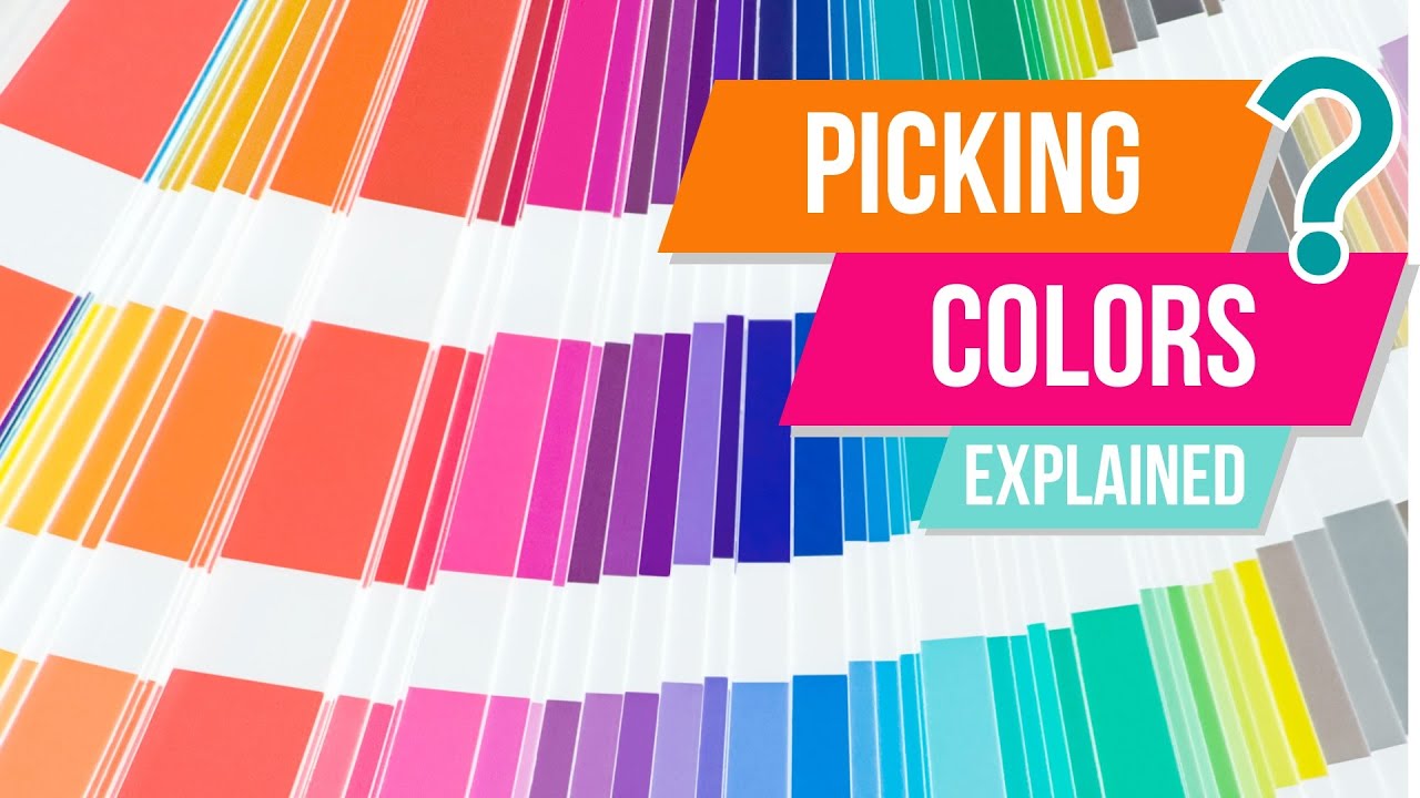
Getting Help From a Color Wheel
An excellent tool for yarn lovers is a color wheel. If you don’t have one, you can find affordable options online. A color wheel helps you find complementary, analogous, or contrasting colors that pair beautifully with your selected base.
How to Use a Physical Color Wheel
This isn’t complicated—it’s a visual tool designed for simplicity. Take your yarn and align it with the closest color on the wheel. If you’re looking to create a subtle design, stick to adjacent colors on the wheel. For more dramatic flair, go for the ones directly opposite.
For instance, with my mint green yarn, I aligned it with the green tones on the wheel and discovered soft pinks, light blues, and chartreuse greens as great pairings. It’s okay if your match isn’t perfect; a close approximation often works beautifully.

You can also use the color wheel to explore other pairings like yellow and purple or turquoise and orange. These combinations add vibrancy, but they still feel cohesive because the wheel takes the guesswork out of the equation.
Explore these beginner-friendly crochet patterns ideal for testing your new color skills.
A Glimpse Into Digital Tools
For those who enjoy tech-friendly solutions, there are online tools that can help with color matching. Websites like Adobe’s Color Wheel Tool and Coolors allow you to move sliders, test different combinations, and create custom palettes.
With Adobe’s tool, you can even upload a picture, and it'll extract the colors for you. This is especially handy if you’re inspired by nature—a beautiful sunset or a vibrant flower arrangement. You can match your yarn directly to the extracted color palette.

Coolors works similarly. You simply press the spacebar to generate random palettes until you find one you love. You can lock the colors you want to keep while the tool suggests complementary options.
Milk or Mud: A Simple Rule for Consistency
One of my favorite principles when choosing yarn colors is the “milk or mud” rule. It helps keep your palette consistent. Colors in the "milk" group look fresh, crisp, and have been mixed with white. These are your pastels or bright tones. Meanwhile, “mud” colors are richer, earthier tones mixed with dark or grayish shades.
For instance, if I’m working in "milk" tones like mint green and soft pink, I wouldn’t add a murky brown or deep gray. Mixing "milk" and "mud" often creates visual disharmony, so it’s easier to stick to one family.
Learn how to make your crochet projects pop with these practice tips.
Building a Yarn Palette
Once you’ve chosen your base yarn, you can add complementary or accent colors to complete the palette. Here’s how I approach it:
- Main Color (2/3 of your project): Your anchor yarn, like mint green.
- Secondary Color (1/3 of your project): A soft blue that complements your main.
- Highlight or Accent (a pop of color): A neutral white or a fun, bold orange for added spice.
If you’re feeling uncertain about your choices, stick to just two colors. You can always build on this as you gain confidence.
My Favorite Yarn Color Tools and Tricks
Along with physical and digital tools, I like to keep things simple:
- Shopping Smart: When you’re choosing yarn in-store, lay the skeins down together. If they look great side by side, chances are they’ll work well in your project.
- Photo Test: Snap a quick picture on your phone to see how the colors play together. The screen can give you a fresh perspective.
- Nature’s Inspiration: From plants to landscapes, nature offers endless ideas for color combinations.

These strategies make yarn shopping a whole lot easier and more enjoyable.
Consider using a yarn conversion chart for even better project planning.
Two Online Tools to Try Today
Here are two of my favorite digital resources:
- Adobe Color Wheel: This tool works like the physical version but is more interactive. You can pick, drag, and explore various combinations at your own pace.
- Coolors: A quick, easy-to-use generator that’s perfect if you’re in a rush but need a professional color palette.
These websites are both user-friendly and free—perfect for beginners or experts.
Let Your Colors Sing
Yarn color selection isn’t a skill you master overnight, but with practice, it becomes second nature. By starting with one base color, using a color wheel, and exploring digital tools, you’re setting yourself up for creative success. Remember: the best color palettes are the ones that make you smile. Trust the tools, but also trust your instincts.
If you’re ready to turn inspiration into action, check out some easy crochet project ideas for beginners that’ll showcase your newfound color skills.
FAQs
1. How do I choose a base yarn color?
Start with a color that excites or inspires you. Think about your personal preference—do you prefer cool tones like blues or warm shades like yellows? This base color will anchor the palette for your project.
2. What is the color wheel, and how is it useful for yarn selection?
A color wheel is a practical visual tool that helps you find complementary, analogous, and contrasting colors. It simplifies pairing by showing which colors work well together. Use it to create subtle combinations or bold contrasts.
3. Can I mix bright colors with neutral shades?
Yes, combining bright and neutral colors can create balance in your project. Use neutrals like white, gray, or beige to tone down vivid colors and let them stand out without overwhelming the design.
4. What’s the difference between “milk” and “mud” colors?
"Milk" colors are light and crisp, often mixed with white (such as pastels). "Mud" colors are earthy and rich, mixed with grays or browns. Stick to one family (milk or mud) within your palette for a harmonious look.
5. Can I use online tools to find matching yarn colors?
Absolutely! Tools like Adobe Color Wheel and Coolors are excellent for creating palettes. You can adjust sliders to explore combinations or base your palette on an uploaded image for inspiration from real-life scenes.
6. What’s the best way to test yarn color combinations in-store?
Lay the skeins side by side and assess their harmony. Alternatively, snap a picture with your phone for a fresh perspective. If they look pleasing together, they’ll likely work well in your crochet project.
7. How many colors should I use for a beginner project?
If you’re new to crochet or feeling unsure, start with two colors—a main color and a complementary one. You can add more as you gain confidence in your color-matching skills.
8. Can nature inspire my yarn color choices?
Yes, nature is a perfect source of inspiration. Look to landscapes, flowers, or sunsets for color palette ideas. Online tools can help you extract colors from photos to match yarn shades.
9. What do I do if I’m unsure about a yarn palette?
Stick to a simple palette with two or three colors. Practice with small projects, like scarves or potholders, to test your combinations. Over time, you’ll become more confident in experimenting with bolder palettes.
10. What is the “photo test,” and how does it help with color selection?
The photo test involves taking a quick picture of your yarn choices. Viewing the colors on-screen can help you see contrasts and harmony more clearly, giving you a fresh perspective.
![]()
Christa Patel is a passionate crochet enthusiast and yarn artist with years of experience exploring the art of crochet. Known for her creative tutorials and easy-to-follow guides, Christa enjoys helping people transform simple yarn into stunning handmade projects.
Her philosophy is rooted in creativity and accessibility—making crochet approachable for beginners and inspiring for seasoned crocheters. Whether through her video tutorials, blog posts, or online courses, Christa combines her love of colors, textures, and techniques to empower others in their crochet journeys.
When she’s not crocheting, Christa loves exploring nature for color palette inspiration, discovering new yarn shops, and sharing her creative ideas with a growing community of fellow crochet lovers. Follow her work to spark your creativity and bring your crochet projects to life!
About the Author
With a passion for crafting easy, beginner-friendly tutorials and patterns, Christa inspires crafters of all skill levels to unleash their creativity worldwide. She encourages yarn lovers to connect, create, and crochet a world filled with beautiful handmade treasures!
How to Choose Yarn Colors That Go Together for Stunning Projects!