Color Theory Made Easy: Mixing Brights, Pastels, and Neutrals for Stunning Spring Crochet
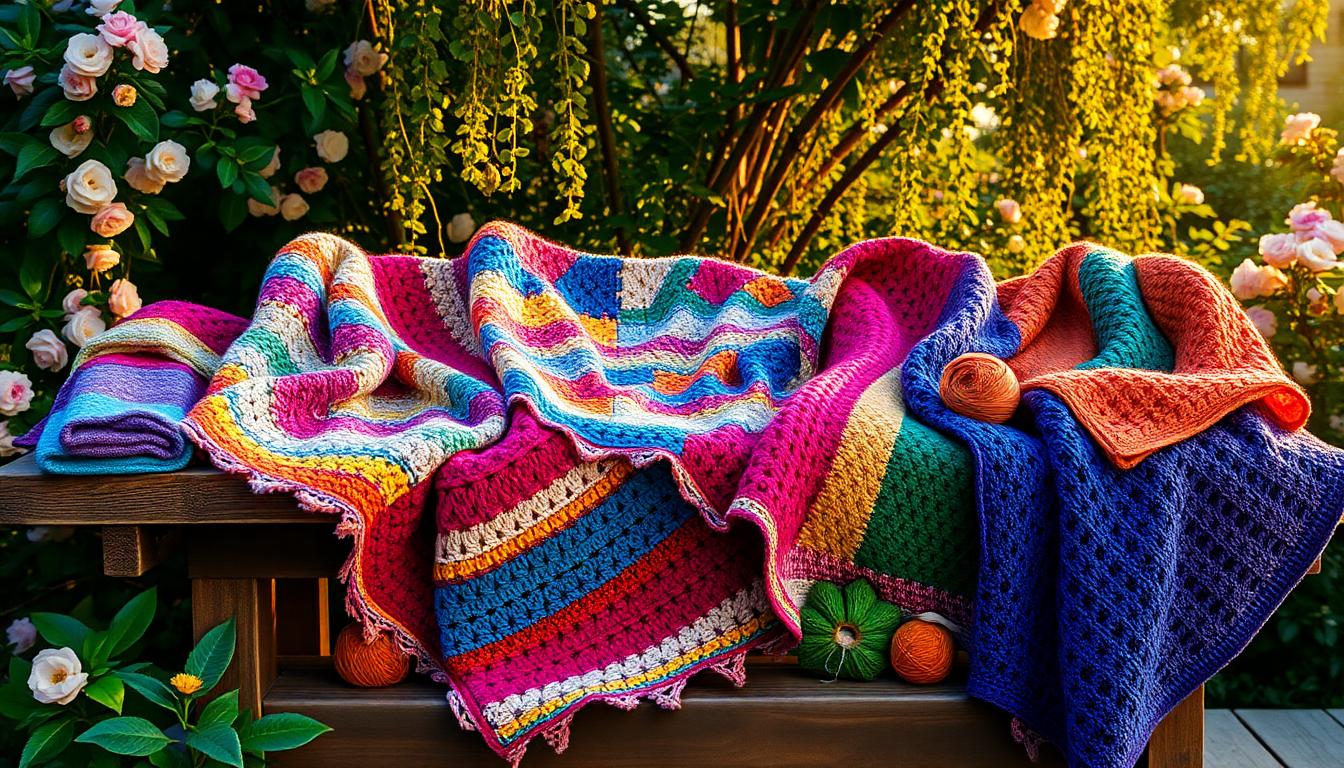
Color theory is the secret sauce behind the most stunning spring crochet projects. It’s all about understanding how colors work together to create harmony, contrast, or even a playful pop. By learning the basics, you can confidently mix brights, pastels, and neutrals in a way that feels fresh and cohesive. Whether you're working on easy crochet blanket patterns or looking for inspiration for seasonal designs, choosing the right color combination can take your projects to the next level. Let’s simplify the process and bring more joy to your projects this spring!
![]()
Understanding Color Theory Basics
When it comes to crocheting, understanding color theory is like having a secret recipe for creating visually stunning designs. By knowing how colors interact, especially in your spring crochet projects, you can elevate your creations into harmonious masterpieces. Let’s break down the basics and uncover how you can mix and match colors effectively.
Primary Colors in Crochet
Primary colors—red, blue, and yellow—are the cornerstone of every color palette. Think of them as the building blocks for your crochet projects. They can stand alone as bold, vibrant shades or be combined to create an entirely new set of hues. For spring crochet, these colors are a great starting point when you're inspired by nature's brilliance, like the clear blue sky or the striking yellow centers of daisies.

For example:
- Red adds warmth and energy to your designs.
- Blue evokes calmness, making it perfect for baby blankets or throw pillows.
- Yellow brings a cheerful brightness that’s hard to resist in spring-themed patterns.
If you're new to working with bold colors, primary shades are an excellent way to get started without feeling overwhelmed. You can also explore beginner-friendly projects like the Eggtastic Easy Spring Crochet Blanket, which incorporates bright hues that celebrate the season.
Secondary and Tertiary Colors for Spring Crochet
When you mix primary colors, you get secondary colors: green, orange, and violet. These shades open up so many possibilities for spring crochet designs. Whether it’s a fresh pastel green inspired by new leaves or a soft lavender perfect for floral motifs, secondary colors bring versatility and charm.
Here’s how they’re created:
- Green comes from mixing blue and yellow.
- Orange is formed by blending red and yellow.
- Violet emerges when red meets blue.
Tertiary colors, like teal or coral, take things a step further by combining a primary color with a secondary one. These nuanced shades give your projects an even deeper level of sophistication. Interested in seeing how these colors work in action? Check out my Amazing Crochet Eggtastic Blanket for Spring, designed with a palette that’s playful but perfectly balanced.
Understanding the foundation of these color categories can help you make smarter color choices. And if you need a more visual explanation, this Color Theory Basics video shows how to mix colors effectively—a must-watch for anyone tackling crochet projects this spring!
By experimenting with primary, secondary, and tertiary colors, you’ll unlock endless possibilities to create unique, eye-catching pieces. Why limit yourself when the color wheel is your playground?
Mixing Brights: Achieving Vibrant Crochet Pieces
Using bright colors in your spring crochet projects is like adding sunshine to your craft. Vibrant hues bring energy and excitement, creating pieces that radiate joy. Whether you're making seasonal decorations or wardrobe staples, integrating bright colors effectively is all about keeping harmony in mind.
Using Brights for Spring Themes
Brights are perfect for capturing the spirit of spring! Think flowers in full bloom, colorful eggs, and cheerful sunshine. They work wonders in festive crochet pieces. It’s a playful design that embraces vibrant yellows, pinks, and greens, ideal for Easter or any spring gathering.
Here are some bright color ideas to explore for popular spring themes:
- Floral Motifs: Use bold orange and pink for petals, pairing them with a soft green stem.
- Easter Decorations: Mix sunny yellows, vibrant purples, and clean whites for egg motifs or table runners.
- Kids' Projects: Bright primary colors pop in fun items like toy baskets or tiny hats.
For timeless inspiration on using vibrant shades in spring-themed patterns, check out my favorite spring crochet creations.

Avoiding Overload with Bright Colors
While brights are delightful, overloading a piece with too many intense shades can feel chaotic. The trick to achieving balance is contrast. Pair them with neutrals or pastels to create a cohesive design that feels polished.
Here’s how I keep bright projects under control:
- Use a Neutral Base: Anchor your design with white, gray, or cream. These tones let bright colors shine without overwhelming the eye.
- Follow the 60-30-10 Rule: Use one bright shade for about 60% of the project, complement it with a pastel or secondary color (30%), and finish with a neutral accent (10%).
- Choose Harmonious Palettes: Colors next to each other on the color wheel, like yellow and green, keep things lively but not overpowering.
If you're still hesitant, consider experimenting with smaller projects to test out combinations. For example, crafting colorful spring shawls provides a great way to play with hues while keeping things balanced.

Vibrant colors are like the exclamation points of crochet—use them wisely, and they’ll make your spring projects unforgettable! Want more tips on color harmony? This article on choosing colors for crochet projects offers excellent guidance for those looking to refine their palettes.
Pastels: Creating Soft and Soothing Crochet
Pastel shades are perfect for bringing a calming, gentle touch to your spring crochet projects. Whether you’re working on decorative home accents, baby items, or lightweight accessories, pastels can infuse your creations with a soft sophistication. Let me show you how to mix and match these hues for stunning results.
Best Pastels for Spring Projects
Pastel colors are a staple in spring designs, symbolizing renewal and freshness. The secret to a captivating pastel palette? Pair soft shades that complement each other beautifully. For example:
- Blush pink and mint green for a romantic, garden-inspired look.
- Lavender and baby yellow for a cheerful yet delicate aesthetic.
- Sky blue with peach tones to channel calm and happiness in equal measure.
These combinations work wonders in crochet projects like blankets, scarves, or table runners. Its pastel hues celebrate the new beginnings that come with spring, combining delicate shades for a fresh, clean look.
Pastel crochet doesn’t just stop at blankets. It’s perfect for smaller projects too. For instance, these Easy Crochet Daisy Granny Squares come to life in soft spring tones, and you can mix and match colors based on your mood or the season.
If you're after even more creative ideas, this collection of free pastel crochet patterns is packed with project inspiration you’ll love.

Combining Pastels with Neutrals
Pairing pastels with neutral shades is a tried-and-true method to achieve a balanced, serene result. Creams, beiges, and taupes not only soften pastels but also let them take center stage without overwhelming the design.
Here are some tips for working with pastel-and-neutral combos:
- Use a creamy white or sand shade to frame your pastel colors. It helps the softer tones pop without looking too busy.
- Alternate pastel and neutral rows in striped patterns to create visual interest while maintaining a calming vibe.
- Incorporate neutrals in accents like borders, trims, or tassels for polished, professional finishes.
For functional and decorative options, these Easy Flower Crochet Coasters are a fantastic small-scale project where neutral bases and pastel details shine together.

Do you love scrolling for inspiration? Check out this Pinterest board on crochet pastel projects. It's filled with examples of how pastel and neutral shades can harmonize beautifully.
By pairing pastels and neutrals, your projects will exude elegance while remaining playful—perfect for everything from cozy throws to dainty accessories.
Neutrals: The Foundation of Any Palette
Neutrals are like the unsung heroes of the color world. They may not grab attention right away, but they provide the perfect stage for other colors to shine. Think of neutrals as the soil in a garden—quiet, understated, and essential, giving life to vibrant hues and subtle pastels alike. In crochet and design, these shades offer endless versatility. Let's explore how to use them effectively.
Using Neutrals with Vibrant Colors
Combining neutrals with bright shades is a foolproof way to create balance in your crochet designs. Whether it's a soft gray against a bold red or a clean white paired with sunny yellow, neutrals have a way of grounding the boldest colors, making your piece feel both intentional and modern.
Here’s why this combo works:
- Contrast Creates Interest: Bright shades pop when set against a neutral background. The contrast not only draws attention to the vibrant hues but ensures they don’t feel overwhelming.
- Cohesion in Variety: Neutrals tie different bright colors together, acting as a unifying thread within your palette.
A good example? Crochet a vibrant, multicolored afghan but use cream or taupe for the base and borders. It keeps everything visually fresh yet cohesive. Need more inspiration? Check out this guide on choosing yarn colors that go together. It’s packed with ideas on combining neutrals and brights effectively.

If you're someone who loves experimenting with textured scarves, patterns like the Dirty Granny Easy Crochet Scarf perfectly demonstrate how earthy neutrals can elevate bright color accents.
So, when planning your spring crochet projects, let neutrals take the lead as the base or background. You’ll find they create a polished, professional look every time.
Neutral Pairings for Spring
Spring isn't just about pastels and brights—neutrals play a big role too! The key is to select spring-friendly neutrals that feel light and fresh, like taupe, cream, or soft gray.
Here are a few pairing ideas to get you started:
- Taupe + Coral: This duo feels organic yet eye-catching—perfect for throws or table runners.
- Soft Gray + Mint: A calming palette ideal for baby blankets or delicate shawls.
- Beige + Lavender: Subtle and romantic, this combination shines in cozy scarves or decorative pillow covers.
For a project idea, consider the Drunken Granny Baby Blanket. Its use of subdued tones makes it a timeless yet trendy spring favorite.

Want even more tips? This article from Elephant Stock on mixing neutrals and statement colors has some excellent advice for pairing neutrals with a seasonal twist.
Spring neutrals open up so many style avenues. Whether you’re crafting for yourself or creating gifts, these shades bring versatility and elegance to any project. Let your neutrals work their magic in pairing with fresh, vibrant hues!
Practical Tips for Mixing Colors in Crochet
Mixing colors in crochet can feel both exciting and intimidating. Whether you're playing with vibrant brights, soothing pastels, or versatile neutrals, finding the right balance is the key to making your projects truly stand out. By testing your color palette and seeking inspiration from various sources, you can craft stunning pieces time and again.
Testing Your Color Palette
Before diving into a project, it's a good idea to test your color combinations. This helps avoid surprises and ensures that your final design looks cohesive. Here’s how I test my palettes:
-
Lay Out Your Yarn: Place your chosen yarn colors side by side. This simple step instantly reveals how the shades interact. Do they clash or complement one another? For extra guidance, you can reference inspiring projects like the Amazing Crochet Tulip Stitch Blanket with Shell Border, showcasing harmonious color blends.
-
Create Swatches: There’s no better way to preview your palette than by crocheting small swatches. Use stitches you plan to incorporate into your project to see how the colors look when worked together.
-
Experiment with Lighting: Colors can appear drastically different under various lighting conditions. Review your yarn under natural light, soft indoor lighting, and even bright artificial lights to understand how it will appear in real life.
Testing your palette is like taste-testing a recipe—it ensures the perfect mix before you commit.

Where to Find Inspiration
Finding inspiration for new color combinations doesn’t have to be a chore. Inspiration is everywhere, and often looking outside the usual sources unlocks creativity. Here are a few places I turn to:
-
Nature: From spring flowers to sunsets, nature provides some of the most breathtaking color palettes. Imagine a pastel blanket inspired by cherry blossoms or a vibrant afghan echoing the hues of a garden in full bloom.
-
Community Projects: Take a peek at Pinterest boards like this one filled with crochet color ideas. It’s fun to see how others combine shades you might not have thought of.
-
Crochet Resources: Blogs like Make Your Home Blooming—Learn to Crochet a Gorgeous Spring Bouquet offer stunning glimpses into seasonal inspiration. You’ll find ideas for fresh, spring-ready palettes to spark your imagination!
-
Interactive Tools: Consider using online tools to visualize palettes and tweak them. Some even let you upload a photo or play with the color wheel to find complementary shades.
Inspiration feeds creativity. Once you find your spark, translating it into a dynamic crochet palette becomes effortless. Don't hesitate to experiment—sometimes, the boldest choices yield the most beautiful results!

Common Color Mistakes to Avoid in Crochet
Crochet is an art form, and like any art, your choice of colors can either elevate or distract from your creation. Picking the right hues isn’t always straightforward, and there are some common pitfalls that can trip up even experienced crocheters. Let’s look at two key mistakes you’ll want to sidestep, ensuring your work is cohesive, eye-catching, and balanced.
Clashing Colors: Show how some colors might not work well together and how to spot this issue early
Ever had a project look "off" after hours of stitching? Clashing colors might be the culprit. Some hues just don’t play well together, creating visual chaos rather than harmony. Bright red paired with neon green, for instance, can clash in a way that screams instead of soothes.
To avoid this, pay attention to color temperature and contrast:
- Warm vs. Cool Tones: Warm colors (like reds and oranges) and cool colors (like blues and greens) often need careful balancing. Mixing the two extremes without a unifying shade can make a design feel disjointed. For example, combining warm yellows with a soft sage green can work, but throwing in a stark turquoise might disrupt the flow.
- Tone Matching: Ensure your chosen colors have a similar vibrancy or softness. A pastel peach next to a deep, bold navy can overpower pastel shades meant to feel delicate.
Testing is key here. Lay your yarns out side by side before starting your project. If something feels jarring, trust your instincts—others likely will notice it too. For more about identifying color mistakes and avoiding them early, check out Beginner Crochet Mistakes to Avoid: Easy Tips for a Smoother Start.

Overcrowding with Multiple Shades: Explain why too many colors can detract from a design and how to scale back
Crochet projects with multiple colors can be stunning, but overusing too many shades in one piece can lead to a cluttered look. The more colors you add, the harder it becomes to ensure balance, making your design look crowded and confusing.
Why is this an issue? Our eyes crave simplicity. Too many contrasting shades can overwhelm the viewer, making it difficult to appreciate individual details in the work. Instead of a beautiful blended creation, the design may feel chaotic.
Here’s how to strike the right balance:
- Stick to 3-4 Colors: A good rule of thumb is to pick one dominant color, one or two complementary colors, and one accent shade. For example, a spring crochet scarf might use lavender as the base, soft green for accents, and cream as a grounding neutral.
- Use the 60-30-10 Rule: This design trick involves allocating 60% of the piece to the main color, 30% to a complementary shade, and 10% to a pop of accent color. It's a foolproof way to balance bold and subtle hues effectively.
- Test with Swatches: Before committing to a palette, try a small crochet swatch with your chosen shades. Viewing them in action can reveal any conflicts or imbalances.
Want a few visual examples? This guide on 35 Cool Crochet Hacks Every Crocheter Should Know includes tips for seamless color changes, so your projects stay cohesive and visually appealing.
By curbing color overcrowding and avoiding clashing tones, you’ll create crochet pieces that don’t just look professional but also feel intentional and well-crafted. These tips will save you time and frustration, ensuring your spring crochet projects blossom beautifully.

Making Spring Crochet Easy and Fun
Spring is the perfect time to experiment with color in your crochet projects. With blooms flourishing and brighter days ahead, incorporating vibrant, pastel, and neutral shades can bring life and freshness to your work. But sometimes, choosing and mixing colors can feel overwhelming—even intimidating. Let’s make it simple and enjoyable by building confidence in your color choices.
Building Confidence in Color Choices
Picking the “right” color combinations doesn’t come naturally for everyone. But guess what? It’s a skill that gets better with time and practice. Think of it like learning a recipe. At first, it might feel tricky to find the perfect balance of flavors, but soon enough, you'll know exactly how to craft a palette that works beautifully.
Here are some tips to build that confidence:
-
Start Small: Experiment with small projects like coasters or granny squares. Smaller commitments are less intimidating and allow you to test out various palettes. Try your hand with the Easy Daisy Granny Squares, and you’ll quickly see which colors you’re drawn to.
-
Use a Ready-Made Palette: The internet is full of curated color palettes designed for crochet and design. Pinterest and visual tools like the Color Wheel offer incredible inspiration. If you're looking for specific seasonal ideas, check out this playlist of crochet patterns for spring, which showcases spring-ready hues.
-
Keep Notes: Ever find a color combination that works beautifully? Write it down! Over time, you’ll build a library of color ideas you can pull from for future projects.
-
Practice Mixing Neutrals, Pastels, and Brights: A neutral base with a pastel accent or a pop of brights can create a balanced, harmonious design. For instance, pairing taupe with lavender or mint with coral can result in soothing spring vibes.
-
Trust Your Instincts: If a combination doesn’t look quite right to you, there’s no need to force it. Lay the yarns out together, take a step back, and adjust until it feels just right.
Building confidence in color selection is truly about repetition and trial. Don’t stress over perfection—crochet is about creativity and expression! If you’re still hesitant, this blog on how to make your home blooming with spring crochet patterns has plenty of inspiration to start crafting with confidence.

By practicing and exploring, you’ll soon find yourself mixing colors effortlessly. And who knows—you might even inspire others with your bold, one-of-a-kind spring crochet combinations!
Conclusion
Mastering the art of color blending is transformative for your spring crochet projects. It's not just about picking pretty hues—it's about understanding how brights, pastels, and neutrals can come together to tell a cohesive story. With a little experimentation and a solid foundation in color theory, your crochet designs will stand out in all the right ways.
Don't be afraid to mix shades boldly or to play it subtle with neutrals. Whether you're inspired by nature, a favorite project, or the color wheel itself, each choice builds your skill and confidence. Looking for ideas? Browse the Spring Crochet section for stunning patterns that bring seasonal color schemes to life.
Dive into your yarn stash and experiment with palettes. The next masterpiece is just a few stitches away! For more tips, check out the Secret Yarnery on YouTube to keep your crochet projects fresh and inspired. Happy crocheting!
FAQs
1. What is color theory, and why is it important for crochet?
Color theory is the study of how colors interact, complement, and contrast with each other. In crochet, applying color theory helps create visually appealing and harmonious designs, enhancing the overall look and mood of your projects. It ensures your color combinations add impact rather than clashing.
2. How can I choose the right colors for spring crochet projects?
Start by considering the season. Spring often inspires pastel shades, bright pops of color, and soft neutrals. Use inspiration from nature (flowers, greenery, and skies), or consult a color wheel to find complementary and analogous color combinations. Test your palette with small yarn swatches to check how the colors work together.
3. What are some foolproof color combinations for spring designs?
- Bright Yellow + Soft Pink + White: Perfect for cheerful and sunny creations.
- Mint Green + Lavender + Cream: A calming and fresh combination.
- Taupe + Coral + Sky Blue: Strikes a balance between neutral and vibrant energy.
Experiment to find palettes that speak to your personal style or match the theme of your project.
4. Can I mix pastels, brights, and neutrals in one crochet project?
Yes! Combining these color families can create a balanced and dynamic design. For example, use neutrals as a base, brights for accents, and pastels for softer transitions. Adhering to rules like the 60-30-10 rule can help ensure your palette feels cohesive.
5. What are the biggest color mistakes to avoid in crochet?
Common errors include:
- Clashing Colors: Pairing colors with conflicting tones or intensities.
- Overcrowding with Too Many Colors: Using too many colors in one project can create visual chaos. Stick to 3-4 harmonized shades for the best results.
- Ignoring Lighting Conditions: Colors can look different under various lights, so always test your palette in natural and artificial light.
6. How do I ensure my colors look good together before I start crocheting?
Test your palette by laying the yarn side by side, creating small crochet swatches, or using digital tools like color palette generators. This prevents surprises and ensures your colors flow well before committing to a full project.
7. Why are neutrals so important in crochet designs?
Neutrals act as a grounding element, helping bright and pastel shades stand out without feeling overly busy. They create balance, simplify designs, and keep your projects looking polished and professional. Shades like cream, taupe, and light gray are versatile staples.
8. How can I gain confidence in choosing and pairing colors?
Start small with simple projects using ready-made palettes or nature-inspired combinations. Practice with techniques like the 60-30-10 balance rule, keep a notebook of palettes you love, and explore resources like Pinterest boards or crochet blogs for inspiration.
9. What tools can help with choosing colors for crochet?
- Color Wheel: Helps you find complementary or analogous colors.
- Palette Generators: Online tools that suggest palettes from uploaded images or pre-designed ideas.
- Pinterest or Crochet Blogs: Great sources for inspiration and seasonal color combinations.
- Experimenting with swatches is always a reliable method.
10. How do I make spring crochet projects beginner-friendly?
Opt for basic patterns like granny squares, blankets, or coasters. Stick to simple color combinations (2-3 shades) before experimenting with more advanced palettes. Choose lightweight and soft yarns that reflect the spring vibe, like cotton or pastel acrylic blends.
![]()
Christa Patel is a passionate crochet artist, designer, and blogger dedicated to inspiring creativity through the art of crochet. With years of experience in crafting vibrant, intricate designs, she has become a trusted voice in the crochet community. Christa specializes in helping both beginners and seasoned crocheters elevate their skills by exploring color theory, experimenting with textures, and crafting seasonal projects that are as functional as they are beautiful.
Her blog, The Secret Yarnery, serves as a go-to resource for crochet enthusiasts worldwide, offering free patterns, in-depth tutorials, and practical tips to make crocheting approachable and rewarding. Christa believes that crochet is not just a hobby but an incredible means of self-expression and relaxation.
When she’s not working on her latest project, Christa can be found hunting for yarn treasures, filming tutorials for her growing YouTube channel, or experimenting with new patterns. Whether it’s creating cozy home decor or colorful gifts, Christa’s mission is to inspire others to pick up a hook and discover the joy of crochet.
Connect with Christa Patel:
- Blog: The Secret Yarnery
- YouTube: Secret Yarnery Channel
- Pinterest: Follow for Inspiration
- Instagram: @SecretYarnery
Christa’s motto? “Let your crochet tell a story.” With her guidance and resources, you’ll always have the tools to craft something meaningful, joyful, and uniquely you.
About the Author
With a passion for crafting easy, beginner-friendly tutorials and patterns, Christa inspires crafters of all skill levels to unleash their creativity worldwide. She encourages yarn lovers to connect, create, and crochet a world filled with beautiful handmade treasures!
Color Theory Made Easy: Mixing Brights, Pastels, and Neutrals for Stunning Spring Crochet