How to Combine Yarn Colors for Beautiful Spring Crochet Projects!
Choosing the right yarn colors can turn a simple crochet project into something truly unforgettable. For spring crochet, color is everything. Think fresh greens, soft pastels, and vibrant blooms—each shade bringing life to your designs. Whether you're crafting light blankets, playful flowers, or home accents, mastering color combinations will elevate your work. I'll guide you through selecting and pairing yarns that perfectly capture the essence of spring.
Understanding Color Basics
Have you ever felt overwhelmed when picking yarn colors for your projects? You're not alone. Picking the perfect combination of shades can feel like guessing in the dark. But once you understand the fundamentals of color, it’s like turning on a light in your creative toolbox. Let’s dive into the basics of how colors work together so you can confidently choose hues that bring your spring crochet projects to life.
The Color Wheel: Your Secret Weapon
The color wheel is a simple tool that maps out how colors relate to one another. Imagine a circle divided into bright slices of primary colors—red, yellow, and blue. From there, we have secondary colors (green, orange, and purple) blending between them. Then, there are tertiary colors, which form when secondary and primary colors mix, creating richer tones like aqua or magenta.
When you’re looking at yarn, understanding the relationships on a color wheel can guide your choices. Complementary colors (opposites on the wheel, like blue and orange) create contrast and pop. Meanwhile, analogous colors (side-by-side, like blue, teal, and green) feel harmonious and calm. Play around by combining these for unique effects.
For a deeper dive, this guide to colorful granny square patterns is a great starter project to practice blending colors.

Warm vs. Cool Tones
Colors are often categorized as warm or cool. Think of warm colors—reds, oranges, yellows—as the cozy glow of a spring sunrise. These shades draw attention and give energy to your projects. Cool tones—blues, greens, purples—mirror serene spring skies or lush foliage, adding calm and balance.
If you’re crafting for specific spaces or occasions, this distinction is your best friend. For example, a spring crochet blanket featuring warm tones might brighten up a dull room, while one using cool tones can add a relaxing vibe. Mixing warm and cool tones? Balance is key—too much warmth can feel overpowering, while too many cool tones might seem subdued. Explore more about calming home crochet styles here.
The Power of Neutrals
Neutrals are your best supporting act. Think whites, creams, grays, and blacks—these hues don’t steal the spotlight but instead frame or tone down your bold colors. Want a soft spring palette? Pair pastels with neutrals like ivory or light gray. Or, to ground vibrant tones, opt for charcoal or a warm beige.
Neutrals are also perfect for transition points in multicolored projects, like stripe dividers or borders on a crochet pillow. Simple but impactful, they can elevate your design in subtle yet powerful ways.

Learn more about thoughtful color matching for crochet projects to bring harmony to your work.
Don’t Forget Value and Saturation
Two often overlooked elements of color are value and saturation. Value refers to how light or dark a color is. A pastel pink and a deep magenta are the same color in hue but differ in value. Meanwhile, saturation measures how vivid or muted a color looks. High saturation gives bold, eye-catching results, while lower saturation creates soft, understated tones.
Understanding these elements can help you balance your design. If a project feels too jarring, try adding lighter or less saturated tones to soften the look. Conversely, bold tones can add energy and emphasis where needed.
For projects that play with contrasting values, check out this easy-to-follow guide on using multiple colors in granny squares.
Color is your playground—don’t be afraid to explore! Now that you're anchored in the basics, you’re well on your way to mastering the art of yarn color combinations.
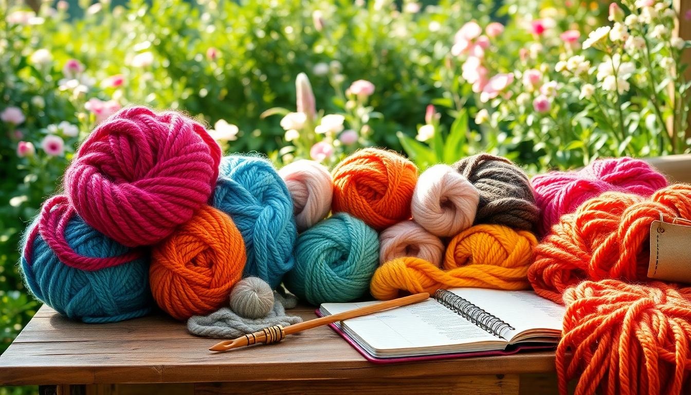
The Importance of Yarn Texture and Material
Understanding yarn texture and material is essential for creating spring crochet projects that feel as good as they look. The texture and fiber type you choose can drastically alter your finished project—not just in appearance but in drape and durability as well. Let’s break down why texture matters and how to make thoughtful choices for your spring creations.

Choosing Spring-Friendly Yarns
Spring is all about softness, lightness, and bright, cheerful vibes. To capture this, opt for yarns in pastel and vibrant shades that embody seasonal themes. Yarns like cotton or lightweight acrylic are excellent choices, as they’re breathable and suitable for warmer weather. Soft blues, pale yellows, or blush pinks make wonderful starting points.
Imagine working on a spring crochet blanket using pastel cotton yarns—it gives you a lightweight, cozy result perfect for those cooler spring evenings. You can follow patterns like the Eggtastic Easy Spring Crochet Blanket to bring your vision to life. This beginner-friendly design combines soft textures and vibrant pops of color for a delightful seasonal accent.
When choosing spring yarns, keep an eye out for color palettes that remind you of blooming flowers or crisp morning skies. These details make the difference between an ordinary project and one that truly captures the spirit of the season.
Blending Textures for Depth
Why stick with just one texture when you can mix and match for added depth? Combining different yarns—like smooth cotton with a slightly fuzzy acrylic—creates visual interest and tactile contrast in your work. It’s like pairing velvet with silk in fashion; the differences complement each other beautifully.
Blending textures works especially well in projects like multi-stitch blankets or accents like borders and tassels. Try pairing a matte cotton yarn with a subtle sheen from mercerized cotton or acrylic threads. For example, adding textured stripes or borders to your blanket design can elevate the look and feel.
![]()
Keep in mind, though, that durability matters. Mixing yarn textures can sometimes require extra care, especially during washing. Understanding the care requirements of different yarns ensures your project maintains its vibrancy and softness. If you need inspiration on blending textures, this collection of cozy crochet blanket patterns is a great place to start.
When combining textures, think of it like creating a bouquet. Each flower adds its unique form and color, but together, they create harmony. The same goes for yarn—you balance smooth fibers with playful textures to design pieces that stand out.
How to Create Harmonious Color Palettes
When it comes to crochet, colors work like a melody in a song—they need to complement each other, creating an effortless blend that feels just right. By curating harmonious yarn palettes, you can turn an ordinary project into a masterpiece. Let’s explore two techniques that will bring your yarn color combinations to life.
Using Color Inspiration Tools
Sometimes, finding the perfect color match can feel like searching for a needle in a haystack. But, we live in a world where resources make it easier than ever. Online tools like the Adobe Color Wheel allow you to play with various hues by exploring analogies, complements, and triads—all from the comfort of your browser. Simply choose your base color and let the tool suggest harmonious palettes for you.
If you're seeking inspiration outside the digital world, nature is a treasure trove of ideas. Picture the transition of greens in a rainforest or the soft pinks and yellows of a peony garden. These natural palettes provide instant color harmony. For recognizable results in your projects, consider pairing these earthy tones with staple neutrals to keep the focus balanced.

For more crochet-specific guidance, check out how to choose yarn colors that go together and let your creativity soar!
Exploring Ombre and Gradient Techniques
Ombre and gradient-colored projects are like watching a sunrise—the colors flow seamlessly, creating visual satisfaction. These techniques are perfect for anyone looking to add depth and movement to their spring crochet projects.
Ombre uses a single color in varying intensities, dark to light. Imagine soft shades of blue transitioning smoothly, like ripples across a lake. Gradient, on the other hand, blends multiple colors, such as yellow turning into pale pink, then blending into light orange. A stunning way to use gradients is to mimic the skies of spring—think dawn or dusk hues captured in yarn.
To achieve this, many crocheters prefer gradient-dyed yarn cakes, which provide pre-arranged transitions. Alternatively, you can make your own gradient by blending yarns manually. Hold two strands together—maybe a pink and a light orange—and swap one strand out for a yellow as you crochet. This technique works wonders for blankets or shawls, adding dimension without complicating the pattern.
If you're looking to try a colorful project that benefits from smooth transitions, the Palm Springs Granny Square pattern is a wonderful project starter. It’s a pattern designed to showcase color at its finest.
By using these techniques and resources, you’ll create yarn palettes that not only look gorgeous but feel cohesive and inspired. Take a chance, mix those colors, and let your crochet transform into a symphony of hues!

Avoiding Common Color Combination Pitfalls
Yarn color choices can make or break your spring crochet projects. While there’s no right or wrong in creativity, some combinations simply don’t work well together and may result in designs that look unbalanced. Avoiding common pitfalls is essential if you want your work to stand out for all the right reasons, so let's explore how you can sidestep these clashing issues with ease.
Identifying Clashing Colors: Explain How to Spot and Avoid Color Clashes
Color clashes happen when hues don’t harmonize visually—or worse, compete for attention in a distracting way. Picture a bright neon pink and a glaring yellow green side by side. Instead of creating contrast, the combination can overwhelm the senses. So how do you identify and avoid such mismatches?
Here’s a quick checklist to get started:
- Use the Color Wheel: Opposing hues on the color wheel—like red and green—work beautifully in balance but can clash when over-saturated or placed next to other vibrant tones. Keep their intensity in check or soften one of the shades.
- Consider Tone and Value: Pairing two colors that are too close in brightness (or too far apart) can lead to jarring results. Imagine pastel pink with deep navy—it works! Now try neon pink with soft peach. Not the same effect, right?
- Stick to a Palette: Limit your palette to 3-4 complementary colors. Mixing too many shades dilutes harmony and makes your project feel chaotic. Simpler is often better.
To experiment safely, try this easy granny square tutorial, which walks you through color changes step by step.
Examples of Better Alternatives:
- Clashing Combo: Neon orange and magenta—both bold, both eye-catching, but together they’re overpowering.
- Better Alternative: Swap neon orange for a coral or peach. Pairing a bold tone with a muted one creates balance.
- Clashing Combo: Purple and red together in their most saturated form can look muddled.
- Better Alternative: Break up the intensity by introducing gray or cream as neutral spacers.
Avoiding color pitfalls doesn’t mean playing it safe—it’s about finding the right balance to let your creativity shine. And if you’re new to blending hues, bookmark this guide on choosing yarn colors that go together for more ideas.

Incorporating Trends and Seasonal Themes
Spring provides endless inspiration for crochet projects, and incorporating current trends and seasonal themes adds a fresh twist to your designs. From pastel blossoms to bold yellows contrasting with soft neutrals, it's all about capturing the essence of spring with creative yarn color combinations.
Pastels for Spring Elegance
Soft pastel hues are the epitome of spring. Think baby blues, gentle peaches, and delicate lilacs—colors that mirror the season's blooming flowers and crisp skies. Using pastels as your primary palette instantly evokes the charm of springtime.
Imagine a lightweight shawl worked up in shades of pale lavender or a crocheted table runner featuring a mix of blush pink and mint green. These subtle tones create an airy, relaxing feel that would brighten any space. When I think about pastel projects, I often gravitate toward cotton yarns for their softness and durability, perfect for showcasing these delicate shades.
Looking for project ideas? This crochet flower planter box is a fantastic use of pastels, bringing blooming flowers into your home—minus the maintenance.

Mixing Bold Hues with Neutrals
Contrast can do wonders for a design. Bold spring hues like fuchsia, sunny yellow, or vibrant turquoise can make certain elements of your project pop, especially when balanced with neutral tones like ivory, soft gray, or even taupe.
For instance, a pillowcase crocheted in bright orange bordered by a neutral beige creates a sophisticated blend of energy and calm. Or consider a tote bag where neon green stripes are grounded by a warm cream background. Balancing these extremes keeps your project visually striking without overwhelming the senses.
If you're keen to experiment with bold and neutral pairings, check out this collection of spring-themed patterns. Bold accents layered with muted tones offer endless possibilities to play with contrast.
Embracing seasonal trends, from dreamy pastels to eye-catching brights paired with understated neutrals, not only celebrates the charm of spring but also inspires unique crochet designs that feel lively and balanced. Why not let your spring crochet projects reflect the vibrancy of the season?

Practical Tips for Testing Combinations
Putting together a beautiful yarn color palette might seem like guesswork, but with a few strategic techniques, you can make confident choices for your crochet projects. Let’s explore how swatching and digital tools can simplify the process of testing combinations and help create stunning designs.
The Power of Swatching
Swatching is a simple but powerful tool for testing how colors work together before committing to a project. By creating small crochet samples, you can preview how your chosen shades interact in real life. Think of it as a dress rehearsal for your yarn!
To start, pick two or three colors you want to test and crochet a few rows using a sample stitch pattern you'd likely use in your final project. This lets you see how the hues look side by side. Are they harmonious? Does one color overpower the others? Adjustments at this stage are so much easier than unraveling a half-finished project later.
Pro tip: Vary your swatches by testing different stitch patterns. A solid stitch might emphasize one color, while an open lacework design showcases how they blend. You can also try transitioning colors within the swatch to test gradients or ombré effects.
If you're unsure about swatching or how it applies to your projects, check out this article on crochet gauge and sizing for additional insights. Even though it's aimed at gauge, swatching principles apply just as much to color testing.
Leveraging Digital Tools for Previews
What if you could test multiple color combinations without using any yarn at all? Digital tools and apps are an exciting way to preview how colors might look in a pattern before you even pick up your hook. Many of these tools allow you to upload crochet charts or patterns and apply virtual colors.
Apps like the Crochet Studio App take things up a notch. They let you generate color palettes based on your photos or favorite designs, offering a fun and quick way to experiment with combinations. You can even design mock-ups of striped blankets or granny square patterns. Curious? Learn more about it here and discover how easy it is to simulate your dream palette.
For those exploring crochet charts, tools like Stitch Fiddle simplify designing by allowing you to visualize patterns directly on-screen. You might find this especially helpful for multi-color projects like intricate motifs or landscape-inspired designs.
If you're unfamiliar with digital tools for crochet, don't miss this guide on reading crochet charts. It includes tips on integrating apps into your toolkit to simplify your process.

By combining the tactile practice of swatching with the efficiency of digital previews, you can confidently test yarn color combinations and bring your creative visions to life. Ready to give it a try?
Showcase Your Work with Confidence
Sharing your crochet creations isn’t just about showing off your talent—it’s also a chance to inspire others and connect with a broader community. Whether you post your work on Instagram, Pinterest, or a personal blog, how you present it matters. Let's explore ways to take your photography to the next level and make every shot "social media-worthy."
Creating Social Media-Worthy Shots
Capturing the essence of your crochet projects is like framing a masterpiece—it takes care, patience, and the right tools. And guess what? Spring's natural light gives you the perfect backdrop to bring out the vibrant hues and intricate textures of your work.
Here are some key tips to ensure your crochet photos stand out:
- Use Natural Light to Your Advantage: Spring's soft, diffused light is a crocheter’s best friend. Set up by a window or shoot outdoors early in the morning or late in the afternoon to avoid harsh shadows and get that glow.
- Declutter Your Background: A clean, simple backdrop keeps the focus on your project. A white sheet or a rustic wooden table can work miracles, drawing attention to the vibrant yarn colors.
- Play with Angles: Don’t settle for just a top-down shot. Take photos from different perspectives—side angles and close-ups highlight unique stitches and textures.
- Incorporate Props Thoughtfully: Add fresh flowers, skeins of yarn, or even a cozy mug to complement your spring crochet theme. Keep props subtle so they don't steal the spotlight.
- Mind the Frame: Fill the frame with your crochet piece, ensuring edges or key elements like borders aren't cut off. This creates a polished and professional look.
For equipment, you don’t need a fancy DSLR—your smartphone camera will do just fine. Just avoid zooming in; instead, move closer to your subject to maintain image quality. If you're new to photographing crochet projects, check out this crochet photography guide packed with tips for capturing stunning visuals.

Want to learn about creating eye-catching beginner crochet projects that look great in every photo? Visit this blog on popular crochet projects for beginners to find your next Instagram-worthy project!
Remember, the right photo doesn’t just showcase your work—it tells a story. By combining thoughtful photography techniques with a genuine passion for crochet, your projects will captivate anyone who scrolls across them.
Conclusion
Mastering yarn color combinations is a game-changer for elevating your spring crochet designs, turning them into professional-level works of art. With the right blend of tones, textures, and saturation, you can create eye-catching pieces that balance harmony and flair. Every project becomes a canvas for your creativity, showing your personality and unique style.
Whether you're experimenting with pastels or diving into bold palettes, confidence is key. Trust your instincts, enjoy the process, and don't shy away from mixing colors that tell a story. If you're curious about refining your color skills further, check out How to Choose Yarn Colors That Go Together for more insights.
Crochet isn't just a hobby—it's a form of self-expression. Let your yarn choices speak volumes and inspire others to see crochet in a new light. If you want even more crochet inspiration, visit my YouTube channel at youtube.com/secretyarnery for tutorials, tips, and creative ideas.
FAQs
1. How do I choose the best yarn colors for spring crochet projects?
Start by looking at nature for inspiration. Focus on fresh greens, soft pastels, and vibrant blooms to capture the essence of spring. Use tools like a color wheel or digital color palettes to simplify the selection process.
2. What are complementary and analogous colors, and how do I use them?
Complementary colors are opposites on the color wheel, like blue and orange, and create bold contrasts. Analogous colors, like blue, teal, and green, sit next to each other on the wheel, creating a harmonious look. Combine these for unique designs or stick with one approach depending on the feel you want.
3. How can I avoid clashing yarn colors?
Use the color wheel as a guide and ensure tones and values work together. Avoid pairing overly saturated or neon hues directly unless balanced with neutrals or softer colors. Start small with swatches to test how the shades look together.
4. What yarn types are best for spring crochet projects?
Lightweight yarns like cotton or acrylic blends are perfect for spring. They’re breathable, durable, and come in a wide variety of colors, making them ideal for blankets, shawls, and home decor.
5. How do I incorporate gradients or ombré effects in my designs?
Use gradient-dyed yarn cakes for pre-blended hues or blend colors manually by crocheting with dual strands and swapping one out at a time. These techniques work beautifully for blankets, shawls, or any project needing smooth transitions.
6. How do I balance warm and cool tones in one project?
Balance is key! Combine a dominant tone (warm or cool) with supporting colors from the opposite category. For example, a blanket with warm yellows could include cool blues or greens in smaller portions to maintain harmony.
7. How important are neutral colors in crochet projects?
Very important! Neutrals like white, gray, and beige frame or soften bold colors. They can act as dividers, borders, or subtle backgrounds for multicolored projects.
8. What tools can help me plan yarn color combinations?
Use online tools like Adobe Color or Crochet Studio App to experiment with palettes. Apps allow you to test color harmony digitally before committing to a project.
9. Can I mix yarn textures as well as colors?
Yes! Mixing textures, like smooth cotton with fuzzy acrylic, adds depth and variety. Just make sure the textures complement each other in weight and care requirements to prevent uneven finishes.
10. What’s the easiest way to test if my color choices work?
Swatching is your best tool. Crochet small samples with your chosen colors to see how they interact under natural light. Adjust your choices based on the visual balance and harmony of the swatch.
11. Are there any crochet patterns that are particularly good for experimenting with colors?
Patterns like granny squares, striped blankets, or ombré shawls are excellent for color experiments. They offer flexibility in design and showcase color transitions beautifully. Check out this granny square guide to get started.
12. How do I showcase my finished crochet projects?
Photograph your projects in natural light with clean, uncluttered backgrounds. Use props like fresh flowers or yarn skeins to enhance the image, but keep the focus on your design. Sharing on platforms like Instagram or Pinterest can also help reach a vibrant crochet community.
![]()
Christa Patel is a passionate crochet designer and fiber artist, inspiring crafters of all levels with her creativity and love for yarn. With over a decade of experience, Christa has built a reputation for making crochet accessible, fun, and endlessly colorful. Her expertise lies in combining vibrant yarn palettes, exploring unique textures, and creating seasonal designs that are as practical as they are stunning.
Christa shares her tips, tutorials, and designs on her blog and YouTube channel, The Secret Yarnery, reaching a global community of crochet enthusiasts. Whether you're a beginner or a seasoned crochet artist, Christa’s approachable style and creative ideas are sure to inspire.
Beyond crocheting, Christa enjoys experimenting with new yarn types, connecting with fellow crochet lovers, and designing patterns that spark joy. You can follow her journey and find more of her designs at secretyarnery.com.
When Christa isn’t crocheting, you’ll find her soaking up inspiration from nature, juggling life as a mom, and dreaming up her next colorful project in her home studio in East Africa.
Looking for more creative crochet ideas or wishing to connect with Christa? Join her at The Secret Yarnery Community and let your crochet journey bloom!
About the Author
With a passion for crafting easy, beginner-friendly tutorials and patterns, Christa inspires crafters of all skill levels to unleash their creativity worldwide. She encourages yarn lovers to connect, create, and crochet a world filled with beautiful handmade treasures!
How to Combine Yarn Colors for Beautiful Spring Crochet Projects!